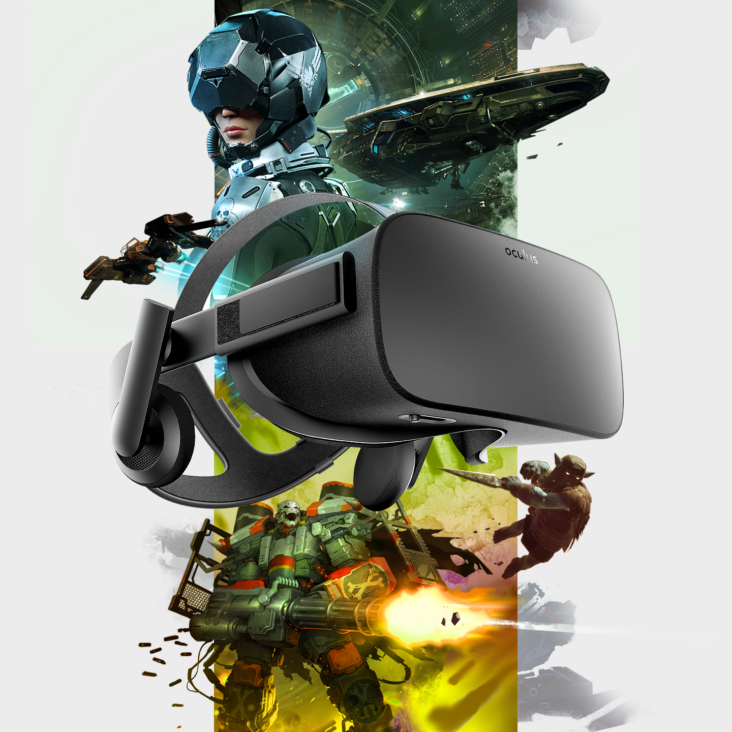
To celebrate the Rift’s first anniversary, Oculus released a set of game bundles as part of a limited-time sale.
These are the promotional graphics I designed for the bundles. I created each image by collaging assets from the games included in each set. There are two versions, corresponding to two different bundles.
This was an Oculus event featuring a gradual build-up of sales over several weeks. The concept behind the graphic was to visually represent that momentum.
Each week, the Rift headset would shed more of its exterior, revealing more of a gold version underneath. By the final week, the headset was fully transformed into gold, symbolizing the peak of the sale and its grand finale.
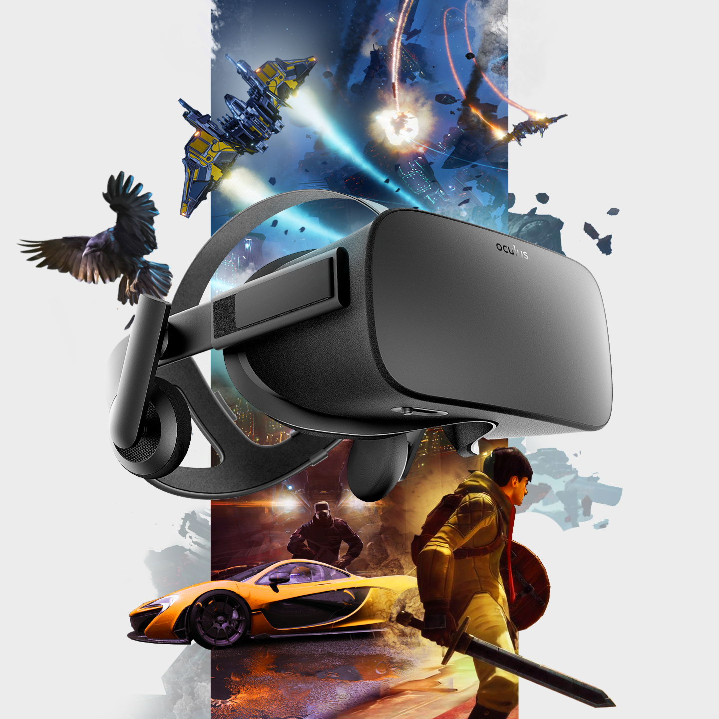
To celebrate the Rift’s first anniversary, Oculus released a set of game bundles as part of a limited-time sale.
These are the promotional graphics I designed for the bundles. I created each image by collaging assets from the games included in each set. There are two versions, corresponding to two different bundles.
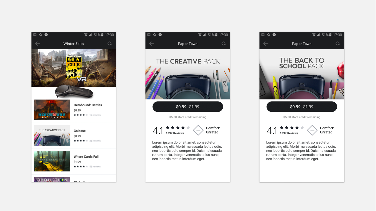
Oculus Gear Controller Launch
Seems like one of the main features of this page is interesting frame breaks. In mocking up some sample pages I tried to choose some art that could lead to interesting versions of this.
01: Akali
With this champion I added a glint to the knife breaking out of the frame on the left. This makes it pop just a touch more.
On the right we have some steam floating out of the frame. It is not quite opaque, and the edge of the frame creates a nice “laser in fog” effect.
02: Cassiopeia
As I have yet to see it, I am not certain if the system allows to break out of the bottom of the frame. If so, Cassiopeia is an interesting champion to do so with. Her bottom-heavy snake body makes for an interesting graphic effect.
Share
While I’m happy with all three of these designs, I’m especially proud of the frame break on the first header. It was a clever way to work within the system’s standard rectangular constraint, using a white color break (matching the app background) to create the illusion of the graphic breaking out of its frame.