This is one of the coolest UX projects I have ever been involved with.
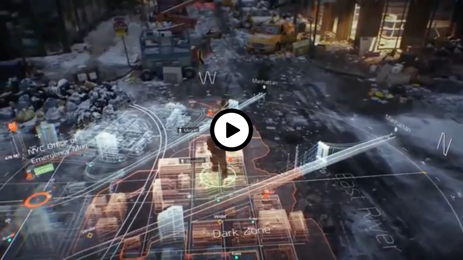
VR is a fairly unexplored space, especially when it comes to user interaction. Oculus had a small problem. Users immersed in a virtual experience would often need to access their PC. This could be to check an email real quick, or just to skip a track on Spotify. This required them to remove their headsets and step back into reality. Oculus needed a way to give users access to their computers without leaving the current experience. The concept of “Dash” was born. This was a very unique and interesting problem to solve.
While I had input on VR prototypes and Unity mock ups throughout the project, my main contribution came early in the process. I was tasked with putting together an initial exploration study and kick off document. I researched several styles of UX delivery as well as basic ergonomics (something most UI doesn’t require but VR demands).
VR is a fascinating design space because it often blends elements of physical product design with completely new, unexplored UX paradigms.
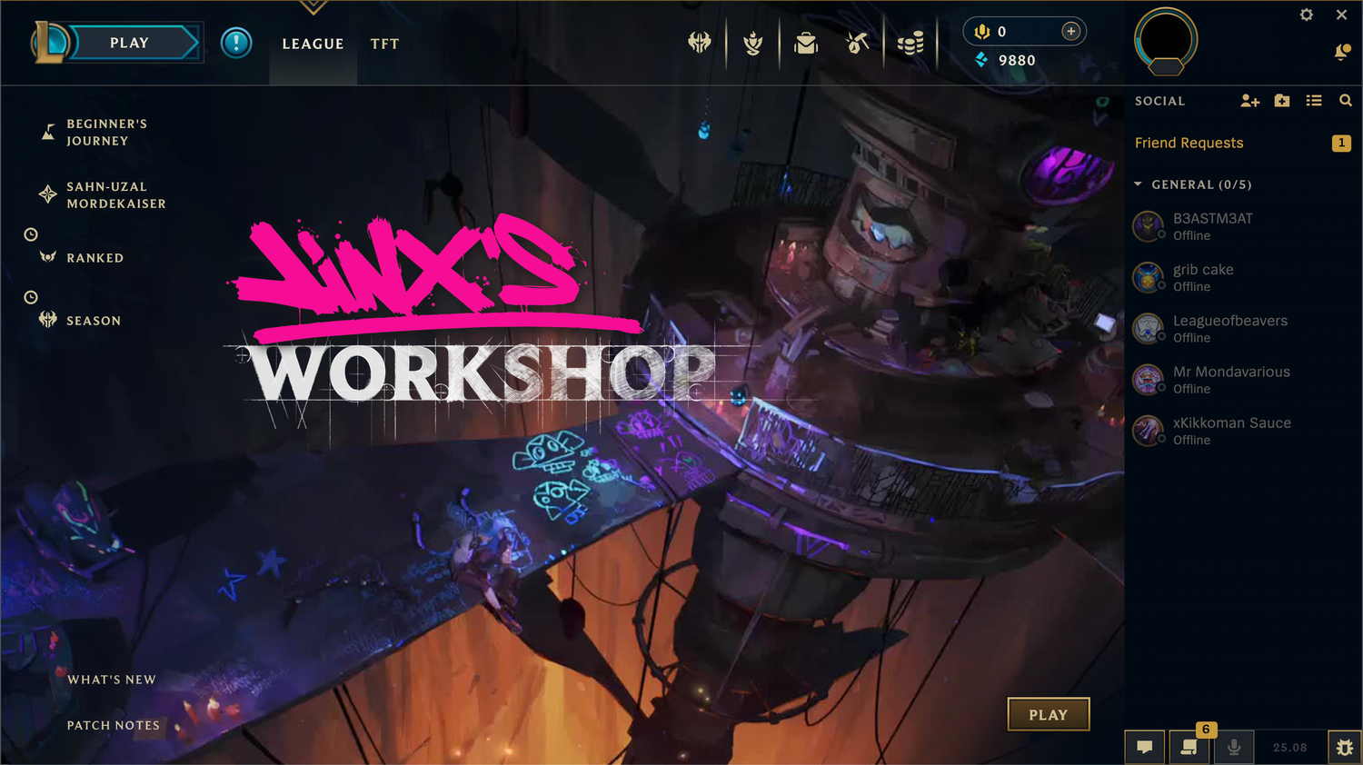
This is a mock up of a fictional event for League Of Legends. Maybe in this event everyone has a weapon made by Jinx (inspired by Sevika’s arm)? I took a few approaches on the splash art
01: Jinx’s hand styles - Something focussed on her graffiti styles as well as her crafting abilities. I really like the hand drawn draftsman look here
02: A vector Jewelry approach - I wanted to make a clean vector art piece.
I was sketching ideas for letters when I came up with the idea to make a graphic based on something Jinx would maybe machine herself. I had the idea for this gold Jinx nameplate.
03: A 3D version of the vector jewelry direction - I had built the vector graphic in a bit of a vacuum in Illustrator. I thought it looked great when dropped into the workshop scene, but I had the thought, what if it was lit to match the scene.
That lead me to thinking about 3D. This was already a pretty skeuomorphic graphic, what if we just leaned into that and rendered it fully. I am very happy with how the lettering looks lit by the scene itself now.
Over time, the League Of Legends items icons have all gotten overhauls and updates. Somewhere in that process the “Rod Of Ages” received a complete redesign and visual replacement.
I thought it would be a fun exercise to reimagine the old design in a the more modern and updated League art style.
This was a promo for a Valentines day sale. I sketched up a bunch of quick ideas and the store manager loved the concept of two controllers together. I also pitched having a bundle of titles that promoted two player game play.
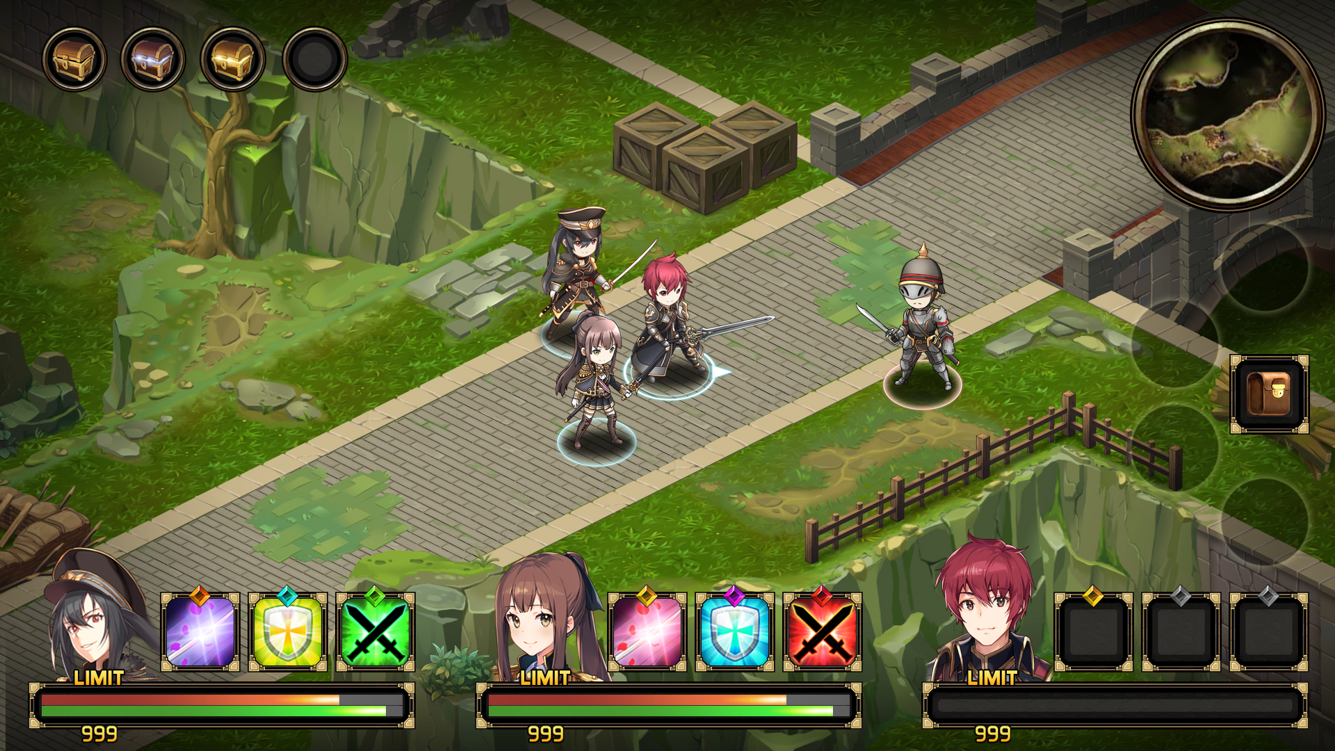
Morbi quis nunc volutpat, lacinia mauris eu, pretium est. Praesent eget venenatis metus, tincidunt gravida mauris. Duis eget quam aliquet, hendrerit tellus sed, egestas turpis. Morbi egestas condimentum egestas. Morbi fermentum mi ut turpis rhoncus sollicitudin. Aliquam pellentesque condimentum ullamcorper posuere nisl.
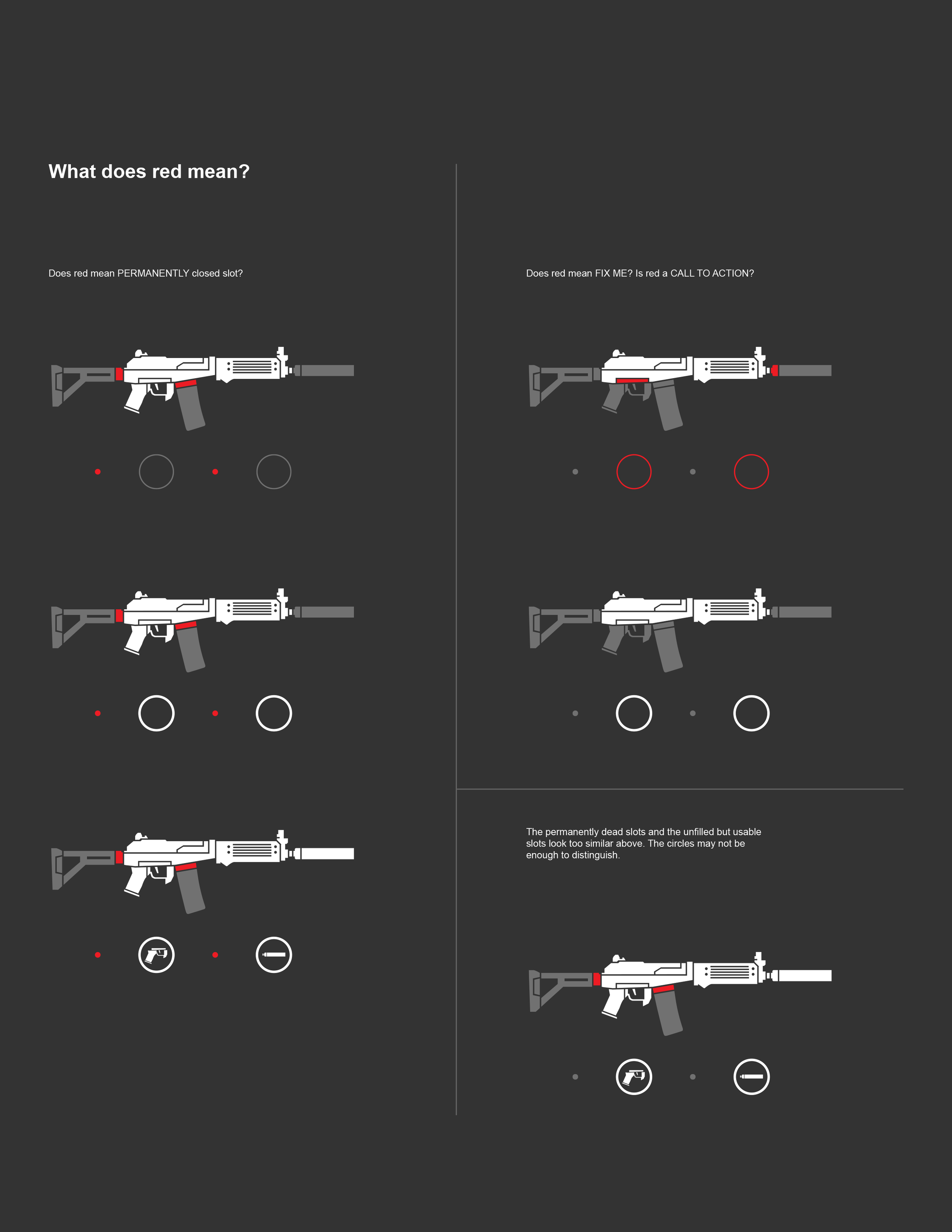
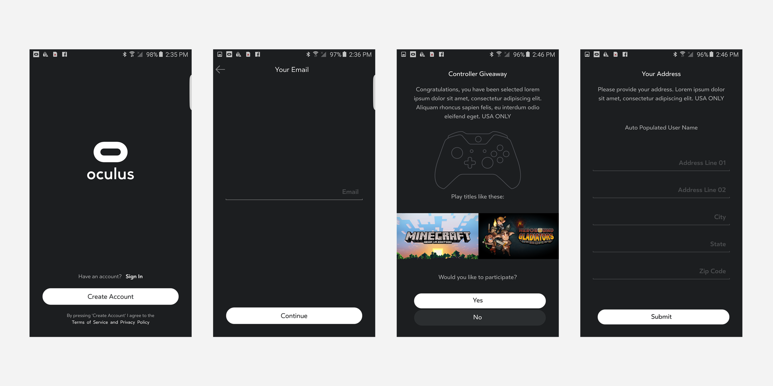
In the early days of the Oculus Rift, there was actually no way for users to request a refund for a game or experience purchase. I was tasked with defining the refund flow across all three platforms: the mobile app, the desktop app, and the VR store.
I introduced a “Purchase History” section to each platform and fleshed out the refund flow. Shown here are early mobile concepts with a few variants, along with some initial desktop designs.
These were a few pitches of treatments for the mobile version of the Oculus store for the Holidays. The cherry on top was changing the spinning loader to a snowflake.
Some stuff about noolooofdjfdashj
While I’m happy with all three of these designs, I’m especially proud of the frame break on the first header. It was a clever way to work within the system’s standard rectangular constraint, using a white color break (matching the app background) to create the illusion of the graphic breaking out of its frame.
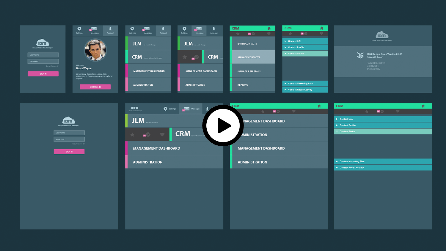
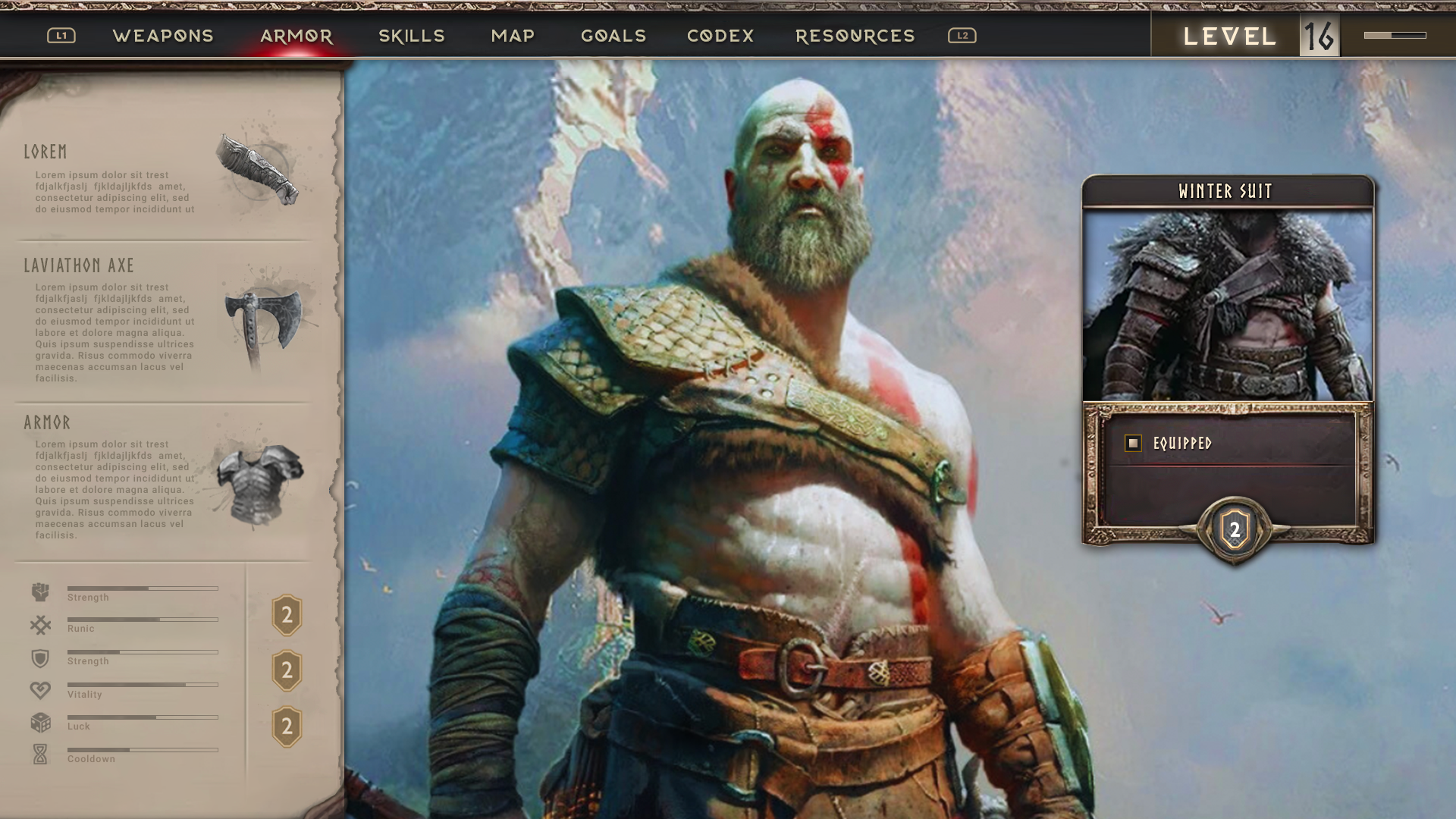
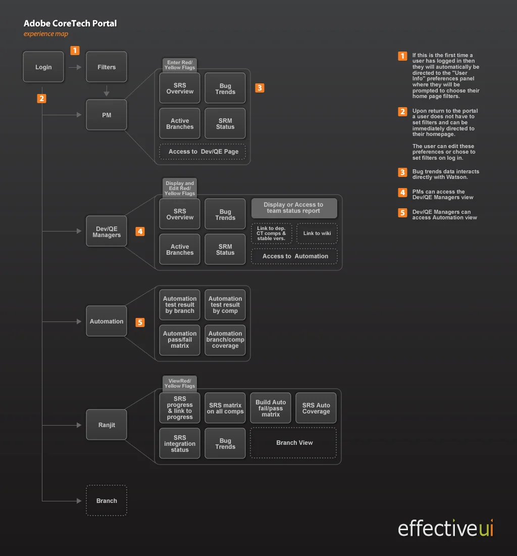
Lorem ipsum dolor sit amet, consectetur adipiscing elit. Maecenas id sapien nisi. Pellentesque quis justo tristique, pulvinar mauris in, venenatis sapien. Integer lectus erat, porta a odio vel, varius malesuada libero. Sed cursus lacus nec sem luctus, commodo egestas eros pulvinar. Class aptent taciti sociosqu ad litora torquent per conubia nostra, per inceptos himenaeos. Nunc venenatis pharetra ipsum a condimentum. Mauris id pellentesque libero. Aliquam erat volutpat. Cras auctor ligula sed mauris venenatis, id interdum tellus hendrerit. Nam tempus velit sit amet justo eleifend, et faucibus orci vestibulum. Nunc sodales mi tincidunt ipsum efficitur, sed scelerisque massa tristique. Phasellus eu leo sed ligula suscipit pulvinar. Praesent ullamcorper dolor vitae imperdiet ornare.